November's artist is yet another Japanese. At first it looked like nobody was really interested in my Murakami Takashi post, but it has been climing up steadily.
I think I reviewed Shimizu Yuko twice in college. But the review from my first year is much better than the review from my second year. I read about her in an illustration book. Her work captured me immediately. I like that she can work both, modest themese and really sexed-up themes. And as some of you may have noticed by now, I really like sexed-up art (but yeah I can appreciate non-sexual art too).
| Target and New York 2005. |
Shimizu's illustarations are something completely different from to the other illustrations (mostly commercial) one sees out there. The way she narrates news and hot topics in her work is rather remarkable. She addresses the topic from her point of view, rather than just illustrating the magizine's/writer's opinion.
Maybe it's not such a bad thing that Shimizu is drawing inspiration from Japanese drawing techniques. In 'Target and New York' we can see rather traditional Japanese calligraphy. Okay well maybe not exactly that traditional, but if you study the soles of the girl's shoes and the tyre of her bike you can see how very Japanese Shimizu's brush strokes are. She uses black ink like a manga-ka would, but in some way, her illustrations are more expressive than any manga I have ever read (gasp). I have read a lot of manga and yes I have seen some pretty extraordinary talents, but manga is still very restricted and there are a lot of rules about how one should draw and construct manga. Whilst Fine Art is more liberal. Even illustration leaves some room for the artist to be creative. I'm having a bit of a hard time trying to understand how Shimizu has managed to publish so many illustrations. I just don't see a big market for an illustration about a girl shaving her pubic hair and making a teddybear out of it, drawn in Japanese style (you wanna see that illustration). But then again maybe this style was popular back then. Never the less, Shimizu is a natural talent and that mirrors her work. The show stopper of 'Target and New York' is without a doubt, the angle. The angle is very dynamic, and don't you feel like you are lying on the ground and the biker girl is about to run you over? The angle is clearly made to address the viewer directly.
The only colour in this piece is red, but it's very well thought over. The article is targeting New York, so Shimizu put a red target over New York. I imagine that that bridge leads to NY. That's all NY we need to see, the article will tells us the rest. Shimizu is just referencing to NY with the bridge and the city on the background. I prefer colourful art, so this is not one of my favourite pieces from Shimizu, but I like how the biker girl is sticking her legs out and how her hair is flying freely in the wind. Very dynamic piece, plus I hadn't seen an illustration like this before.
I'm just contemplating whether it's a good thing that Shimizu is making a commercial thing out of Japanese art or not. Murakami Takashi is doing exactly the same thing, but a little differently. Well anyway, illustrating is all about stories and commercialism. 'Target and New York' accommodates all the rules of good, commercial illustration: simple colouring, strong lines and an eye catching angle. And this piece works for both ways, it's an ad but it can also be Fine Art. In my opinion what could make this fine art, is the Japanese drawing technique. Shimizu clearly has drawn on both damp and dry surfaces to give the image some 'special effects'. Her lines are very clean and simple, it looks very Japanese to me. Personally I think that Japanese calligraphy and Indian ink, can make any art piece look fancy. Personally again, I think that most of Shimizu's pieces would work better as Fine Art pieces than simple illustrations. Most of her works are too detailed and decorated to be 'official' illustrations. Illustrations, especially for commercial purposes, need to be simple yet eye catching. Shimizu's pieces are way too fancy to be simple images ment to promote something. However perhaps it's a good thing that Shimizu is doing her fair share of showing what Fine Art can be like to the masses.
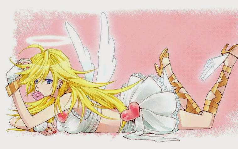
| Fujiyama Sakura-Fubuki 2006. |
'Fujiyama' only has 4 primary colours, but add them to the dynamic image and you get a surprisingly vibrant piece. Grey and light pink go surprisingly well together. And those partly erased black ink lines just add to that Avant-garde idea this piece seems to be going for. I think it was rater cleaver to erase the outlines a little, especially the clothe's outlines. Makes them look more soft and vabric-ish. If Shimizu had kept the black lines really strong I fear they would have disturbed the look of the image because the rest of the colours are already so tender. The image itself is a lot of fun and in a way very cheeky. Here we have a sort of a Japanese Geisha-rock star who has come to spread her music throughout the Western lands. She is very proud of her heritage and country, but as a rock star she can also make fun of her culture and take advantage of it to make her look more exotic for the Westerns. I would definately wear this image on a shirt.
| Blow-Up Nr. 1, The Bubble 2010. |
"AD gave me a lot of freedom so I was able to play around and experiment with coloring, composition and imagery itself. Using this image as a starting point, I decided to create new pieces that play around with the definition of word ‘blow up’: bubble, storm blowing and explosion".
Overall, Shimizu's take on things is interesting. It seems to me that she would be able to take any subject, and create something of her liking from it. I'm not quite sure what the idea behind 'The Buddle' is, but the image looks great. I'm guessing someone is in a rush to orgasm and the others are holding them back. But this is just a wild guess, the image is rather suggestive though, in a modest yet obvious way. Shimizu must have spend hours, maybe even days drawing this image. Naturally the result is a-may-zaah. This piece is a superb illustration, but I could also see it blown-up and framed, like Fine Art. In 'The Bubble' we see some classic presention of Shimizu's detailing in the clouds and characters. It must have taken some training to get one's eyes to properly focus on the characters one is drawing. At least my eyes start to hurt when I stare at the thing I'm drawing/detailing for too long. However I'm sure one gets used to it after one does it on daily basis. Anyway, this is not my favourite pieces from Shimizu, again, but I'm trying to direct your attention to the details and concentration Shimizu presents in this piece. It is a very powerful and detailed piece, and if I hadn't seen her portfolio, I'd say this must be her most detailed piece. However I have seen her portfolio, and I know that she is capable of doing even more detailed and fancier illustrations than this. 'The Bubble' is a great piece among the others, it's just the subject that baffles me. What the hell is going on in this piece!? Maybe that's why I like it so much, because it's so Avant-Garde and so, so Japan!
| Playboy. Sex Story 2011. |
| Butterfly Hunting 2012. |
Perhaps Shimizu wanted to direct the viewers eyes to the butterflies specifically. I just find it really charming how the person holding the net, caught the other kid too. Or perhaps they weren't aming for the butterflies at all, but for the kid. That's a funny idea, but in my opinion, kids would try to pull of something like that xD
In case you were wondering what technique she uses, Shimizu draws the image first with pencils and ink on watercolour paper. Then she does a little bit of shading and colouring until she scans it, and applyes the rest of the colours with photoshop. She does all the final touch-ups with photoshop too. This piece is just another example of Shimizu's photoshopping skills. It's beautiful, but I feel a little bit cheated that she didn't actually paint the piece herself, but resorted to multimedia. I like multimedia art, but personally I appreciate Fine Artists much more because they do everything by their hands and from scratch. Personally I think multimedia is cheating, you get all these wonderful effects and results with photoshop etc, but basically you didn't make the image yourself, a computer program made it for you.
If you go through her portfolio, you can see that Shimizu is not 'a one hit wonder'. Her themes are interesting and her palettes are interesting. The colours and the themes seem to be in perfect harmony in every piece of hers (and sometimes it seems like it's the colours that make the whole image look interesting. That the theme wouldn't look interesting without the innovative palette). Shimizu expresses a wonderful sense of fantasy and imagination in her works, but she also continues to drawn inspiration from reality. Her technique and style never changes, but there's a variation there, and that variation keeps the viewer/fan wondering what's yet to come. http://yukoart.com/
I hope you enjoyed my review on Shimizu Yuko. Next I'm thinking about doing either Henry Darger, which would be really interesting, or Hergé O_o Although Hergé deserve a big review, like Tove Jansson, and I haven't done that much research on him yet. We'll see..
See you in Decembre! Thanks for reading!
A.P
Ei kommentteja:
Lähetä kommentti